
When it comes to website optimization, giving customers too many choices may be hurting your conversion rates. On the surface, this may seem illogical, but here’s the science.
In 1999, two researchers set out to discover if more options really were better for sales. They set up a booth and offered taste tests at a local grocery store, where customers could taste jams.
In one test, they offered customers twenty-four different jams to taste.
In the other, they offered customers six different jams to taste.
This is what they found:
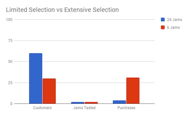
Graph 1: Results of the “Jam Experiment.”
Twenty-four choices of jam attracted more shoppers (60%).
Shoppers tasted the same number of jams in each test.
Only three percent of tasters (4 shoppers) bought jam from the taste test that offered twenty-four jams, while thirty percent of tasters (31 shoppers) bought jam when offered only four options.
So what’s going on here? After all, online retailers like Amazon seem to have made their living on offering a huge selection.
Liraz Margalit, Ph.D, explains: “Intuitively, people feel that the more options they have, the greater their chances are of finding the choice that will perfectly satisfy their needs.”
This explains why more people were attracted to the booth that displayed twenty-four jams. But why didn’t they buy?
“But this intuitive assumption turns out to be an illusion – the more options we have, the less likely we are to make a decision at all.”
In terms of customer behavior, making no decision at all means they don’t make a purchase.
On one hand, offering a wide selection is good business because it increases your pool of potential customers. However, no single customer wants to buy everything you have, so it’s best if they only see products they’re interested in, and not too many of them.
“In the beginner’s mind there are many possibilities, but in the expert’s there are few.” —Shunryu Suzuki
Humans can only efficiently compare five or less choices at a time, so use this as a guideline for curating the collection of choices you offer, so your customer never gets overwhelmed. Give them the expert’s view of their options.
Reduce the number of choices in these five areas of your website for more conversions.
Reduce the number of featured products on your homepage to three or less.
Your homepage is usually the first place a customer will go when the come from a search engine. It’s imperative that your homepage doesn’t invoke immediate purchase anxiety and possible avoidance behavior.
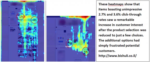
Figure 1: Heatmaps of customer interest
It’s wise to have featured items on your homepage, but you don’t need that many. After all, until you have a search query from the customer, you don’t know what they’re looking for.
How to implement this on your site:
- Reduce the number of featured items on your homepage to five or less.
- Run A/B tests with different numbers of featured items (between 3-5) and determine which layout gets the most clicks.
Consolidate navigation panes to the fewest possible categories.
This is especially true for your shopping categories. It’s tempting to be as specific as possible, the idea being that the customer will most easily locate exactly what they want.
The problem is that then there are far too many options to navigate or evaluate efficiently.
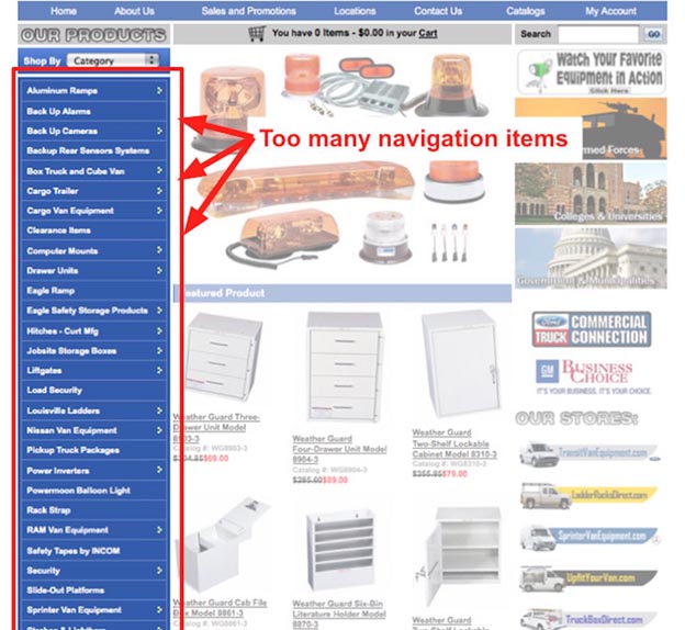
Image 1: Example of too many navigation options.
Simplify your navigation pane as much as you can. Depending on your business, it may be impossible to get this down to five or less. Just keep it as simple as possible.
An effective way to make your navigation pane searchable rather than specific is to look for different ways to group your products together. Sometimes there are a lot of items that have a single intended use, so listing your products by function could significantly simplify your navigation pane.
How to implement this on your site:
- Change the way your items are categorized (i.e. switching from categorizing by type to categorizing by function) to make your navigation pane more searchable.
Avoid the rotating banner, and stick with a single hero image.
Eliminating the rotating banner (also called “sliders” or “carousels”) limits the options your present on your homepage, and removes any distraction from any value propositions or offers on your homepage.
Researchers at Notre Dame found that only the first image in a rotating banner got any clicks. Even worse, that first image only drew 1% of clicks!
A rotating banner is a huge amount of webpage real estate to invest in a 1% click-rate.
Instead of a rotating banner, use a clear central hero image that emphasizes the call to action for your main promotion. Also make sure that your hero image is well placed on any device or screen size.

Figure 2: Hero image placement.
How to implement this on your site:
- Create a unique version of your best hero image for each popular platform or screen size so your website looks great, and is functional on any device.
Control the number of search results shown on each search results page.
Given a person’s limited ability to evaluate more than five options, it stands to reason that showing more than five results on a search page will be inefficient.
A great example of solid results curation is Google’s results page.
Image 2: Google results page.
The number varies slightly, based on the display text and images in the search results. However, Google has done a great job of organizing the results so that—unless you’re using non-standard display settings—usually between five and eight search results are displayed per screen.
Obviously, more than one page of results is almost inevitable. But think of how often you choose something from the first page of your search results.
Displaying customer query results in pages of four or five will make it less stressful for your customer and more likely to lead to a sale.
How to implement this on your site:
- Set the default number of search results per page to five so that your customer can efficiently evaluate the results on each page.
Minimize the number of fill-in fields in your checkout flow.
Checkout flow optimization is huge. The best practice here is to get to the end of the transaction in the fewest clicks possible.
Billing and shipping information are unavoidable fill-in fields. But also consider the number of options you offer for things like shipping. Abandoned shopping carts are the bane of online retailers.
Avoid scaring customers off at the last second. It sounds counterintuitive, but limiting your shipping and payment options is the best choice.
For shipping, the vast majority of your customers either want the cheapest or the fastest. So three shipping options (cheap, fast, intermediate) will satisfy nearly all of your customers.
Additionally, setup your checkout flow to auto-select the fastest shipping option, and make the decision for the customer. Also, ask for their zip code first, and use the zip code to autofill state, city, and country fields.
The same goes for payment options. PayPal, Google Wallet, Apple Pay, and credit card will serve almost all of your customers. Go one step further, and only ask for the credit card number. You can use the credit card number to determine the type of credit card so the customer doesn’t have to select it from a menu.
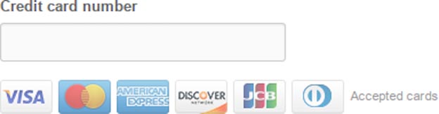
Image 3: Credit card form without card selection dropdown menu
The idea here is not to give 99% of your customers a reason to opt out of the buying process at the last minute just to appeal to that 1% of customers who want to write a check to have hoola hoops sent by sea freight to Hawaii (I’m exaggerating. The ratio is probably closer to 80/20).
How to implement this on your site:
- Reduce your offered shipping options to three and auto select the fastest option for your customer.
- Collect zip code information early in the checkout process to autofill address fields like city, state, and country for your customer.
- Offer five or fewer payment options and use the entered credit card number to autofill the credit card type.
Takeaways to help you start simplifying your website now.
To get an overall sense of the most optimal website design, think of the jam experiment.
They set up a jam tasting booth in a grocery store. All the jams a customer could ever want were back there on the shelves. But they were more likely to make a purchase when they were presented with just a few of all those options.
Think of your entire online store as the grocery store, and each webpage, and information or navigation pane as a tasting booth. Keep lots of potential options in the store, but only show a few at a time.
To start getting more sales from your website now, implement the easiest three simplifications (which can be done using mostly the delete key):
- Cut the number of featured products on your homepage to three or less.
- Remove the rotating banner on your homepage, and turn the first image in the rotation into your hero image.
- Get rid of all but the three most common shipping options (cheapest, fastest, intermediate/best value) in your checkout flow.
Once you’ve started simplifying your website with these quick improvements, implement the rest of the changes to make your website even better.
Got an Ecommerce Business?
A Free 20 minute call with us could mean a steady 20% Increase in sales each month.