
Toilet products are not what you normally think of as examples of brilliant marketing. People in need of such products usually want to keep it a secret, and rarely celebrate any of their acts surrounding pooping. Not so for Squatty Potty.
Far from the subtle hints typical of health industry marketing, Squatty Potty has gone for a direct, humorous, and somewhat surreal approach. The Squatty Potty brand is bold, brilliant and unapologetic.
Rarely in marketing has the word ‘colon’ appeared so many times, to such dazzling effect.

In short, Squatty Potty nails marketing that you remember.
In this post, we’re doing a deep analysis of Squatty Potty’s online marketing strategy to find out what makes them so successful, and what they could do better.
We look at their website UX, social media, performance marketing, SEO, email marketing and display advertising. We also take a peek at how their doing with internationalization and the tech stack they’re using.
What they do
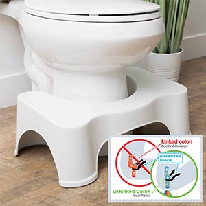 Squatty Potty is a family business headquartered in St George, Utah, whose unique selling point was their trademarked toilet stools.
It was founded in 2011 by the Edwards family. They claim that their design enables better bowel movements by encouraging a natural ‘squat’ position.
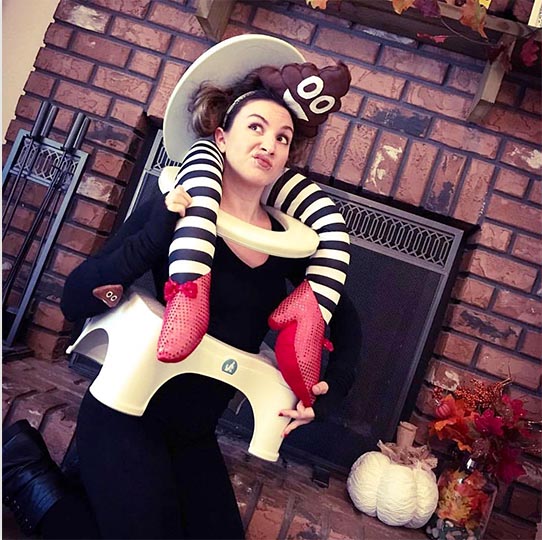
The real surprise is how popular their product has become — and how enthusiastic their fans are at sharing photos.
Squatty Potty is best known for its viral video, featuring a dreamlike sequence in which a fairytale prince talks the audience through the rainbow bowel movements of a cartoon unicorn. Yes.
You read that correctly. Check it out.

Their epic marketing strategy has resulted in online sales of the Squatty Potty rocketing by more than 600%.
Retail sales also jumped by more than 400% at Squatty Potty’s largest stockist, Bed Bath & Beyond. This was not by accident, considering they hired the Harmon Brothers, with their impressive history of past successes with Purple, Fiberfix and Poo-Pourri.
Viral marketing
Their epic marketing strategy has resulted in online sales of the Squatty Potty rocketing by more than 600%.
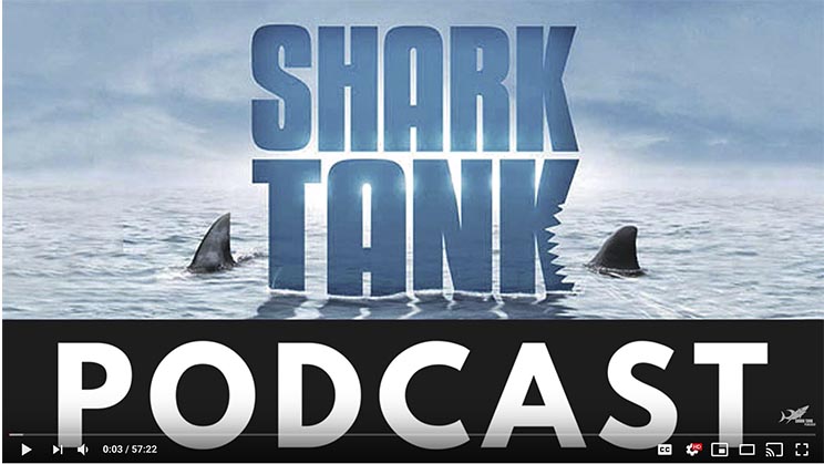
Squatty Potty has executed a high-growth strategy to disrupt an unusual niche. The company started kicking off when it’s family founding team appeared on ABC’s business reality show Shark Tank.
Against the advice of their investor, CEO Bobby Edwards hired the Harmon Brothers marketing agency to produce what he hoped would become a viral marketing video for Squatty Potty.
The Harmon Brothers had already made its name in marketing other poop-related products. hey were clearly the right choice for Squatty Potty’s limited marketing budget.
The video ended up becoming every marketer’s dream.
That viral video has racked up more than 150 million views, vindicating Edwards’s ecision to take a risk with his startup’s precious marketing dollars. It’s credited with the huge leap in their sales and cementing Squatty Potty’s position as a household name.
Shark Tank interviewed mother Judy and son Bobby after the show about their success.
UX
It’s not just about having a viral video. After you’ve snagged their attention, you must think about what happens when visitors click through to your website.
The UX of your ecommerce site makes a huge difference to how many visitors convert. Let’s take a look at Squatty Potty’s.
The homepage
Squatty Potty has gone for a long, scrolling homepage (aka long form) for better user experience (it’s not a true one page site as the website has many other pages).
They use it to tell a story about Squatty Potty that engages visitors and invites them to purchase.
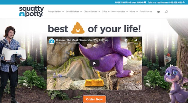
A new marketing video is the first thing you’ll see. Within a month, it already had more than 100,000 views after being launched on October 17 2017.
it’s magical themed and full of puns. A cute anthropomorphic purple dragon reads out Amazon reviews — a unique way to incorporate social proof with peer reviews that we have not seen in this unique fashion until now.
Looking at a predictive eye tracking map that analyzes the design of the homepage, we can see that the eye is drawn to the logo, the tagline and the call-to-action. Squatty Potty has smashed it with their UX design.

It’s a high impact design with a lot of information and different elements to look at. Although very busy, it’s ideally optimized to draw the user’s attention toward the bright orange ‘order now’ button, which appears above the fold.
Having a prominent call-to-action increases conversions 591%, so Squatty Potty has done well here. Ideally, they would reduce the prominence of the other elements like logo and tagline to increase attract more attention to their call-to action.
At the moment, attention is also drawn away towards the company logo in the top left hand corner, which should already be recognizable to potential customers. This helps build trust in the site that it is representing the Squatty Potty brand.
Recomendations: Make sure your call-to-action button appears above the fold in a prominent place to catch the user’s eye. Choose an eye-catching color and don’t forget the compelling copy. A/B testing is a great way to choose between different designs and improve CRO (Conversion Rate Optimization).
Contrasting with the UK site
We’ll just take a moment to contrast the squattypotty.com homepage with squattypotty.co.uk and decide which one customers will be more likely to buy from. The results are startlingly different.
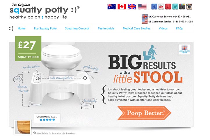
It’s almost like .co.uk domain has been wound back 10 years and there’s not a cute unicorn or dragon to be seen until you get below the fold.
They’ve gone for a traditional approach to market Squatty Potty with British customers. Their branding is totally different, and they’ve primarily emphasized a clinical-looking, factual diagram to explain the benefits of Squatty Potty.
There is still a sprinkling of their signature punnery, but this is a much more demure site than the .com domain. In fact, the target audience seems like it is much older.
more demure site than the .com domain. In fact, the target audience seems like it is much older.
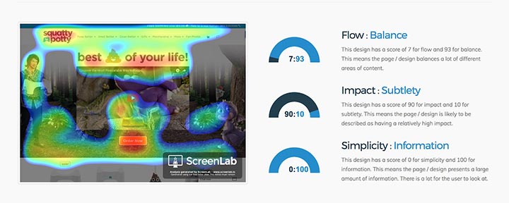
Taking another look at the predictive eye-tracking map, we can see that the eye is being drawn in lots of different directions.
The biggest focus is the long copy that factually explains the science behind Squatty Potty — a big contrast to the more visual-heavy squattypotty.com domain.
Squattypotty.co.uk is not as well optimized for conversions like squattypotty.com. The UK market is clearly not a high priority for them. Perhaps they perceive the Brits as far less likely to get vocal about pooping, and only visit their site out of necessity. We prefer their US site for now!
The potties / product pages
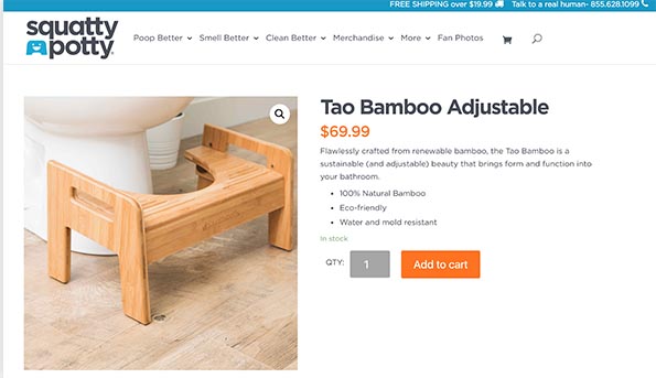
Squatty Potty’s product pages have avoided their signature humor. They’ve taken a far more business-like approach which works in their favor, as by the time their customers have reach this point they’re already interested a pruchase.
Any superfluous information could be distracting.
They seem like they’ve ve taken design inspiration from retail giant Ikea.
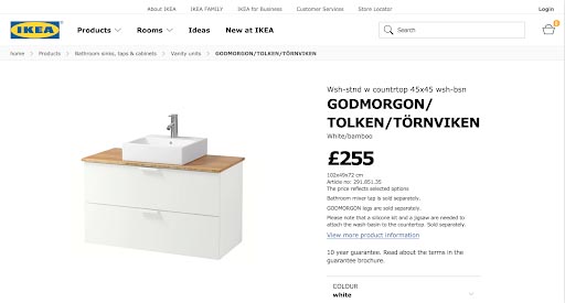
However, Squatty Potty has improved upon Ikea in this instance because their ‘Add to Cart’ appears above the fold, prompting customers to click, and is rendered in an eye-catching orange. This may be because Ikea does not offer online delivery in all areas, and requires its customers to purchase and pick up items in store.
Without being able to physically handle the product, Squatty Potty recognizes that their ecommerce shoppers need to see their products close up. Not surprisingly, 70% of online customers rate being able to zoom in on product images as a top priority when it comes to making a purchase decision (UPS).
On Squatty Potty’s website, you can zoom in closely on Squatty Potty’s products. It’s easy to scroll through the different product images as well. Their site is optimized for mobile with images showing up clearly, the UX intact even on a small screen.
Recomendations: It’s all about the images for your ecommerce site. If your visitors can’t see your customers in high definition, they are less likely to purchase. Enable a zoom function for your product images and include images from multiple angles.
The basket
Squatty Potty avoids springing surprise fees on its customers by letting you calculate your shipping fees before even heading to the checkout.
If you implement this as part of your CRO strategy, beware of adding in too many steps before your customers even reach the checkout page and your tactic backfiring. 27% of US customers will abandon their purchase if the checkout phase is too long (Bamyard).
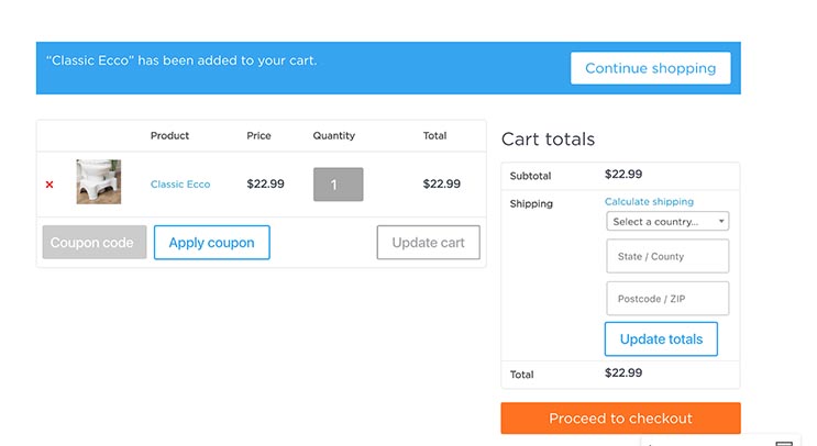
This is a smart idea, since the North American Technographics Retail Online Benchmark Recontact Survey found that 44% of potential customers will abandon their cart if the shipping cost is too high, or if they encounter what they perceive as hidden charges (Receiptful).
The key is to be as transparent as possible with your delivery policies, since customers don’t appreciate it when companies try to pull the wool over their eyes.
Recomendations: Disclose all charges up front, as the checkout is not the place to learn about shipping costs. Customers intuitively sense when they are being tricked, and underhand practices will not endear you to them.
The checkout
The transition from basket to checkout is the phase where e-commerce businesses are most likely to lose their customers.
Customers are put off by long forms. Research by Bamyard shows that the ideal checkout flow contains 12-14 elements, and yet most checkout processes contain a whopping 23 form elements. It’s good that Squatty Potty enables you to pay with Amazon because the familiar brand creates more trust with online customers. Using Amazon is also much faster than manually filling in the billing form.
Once you enable Amazon pay on their site, ordering is as simple as pressing one button. How’s that for speed!
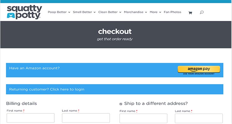
Sadly, their shipping is not that fast. They can only guarantee shipping within 3 – 8 working days. This is because they don’t have control of the delivery network — unlike, for example, Amazon.
This is a big area where they could improve as fast delivery is a big concern for ecommerce customers. 92% of US customers view delivery in 2 days as ‘fast delivery’, versus only 18% that say delivery within 5-7 days is as fast (Criteo).
Their current setup could result in a large number of lost customers who are too impatient to wait for their Squatty Potty.
Recomendations:It’s not about more traffic, It’s about increasing the conversion rate of your existing traffic — which costs far less than acquiring more visitors. This means optimizing your ecommerce website to make choosing to not buy nearly
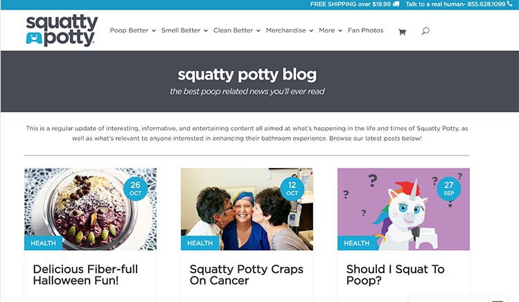
The blog
Squatty Potty doesn’t have a particularly robust blog. They’ve gone for a typical corporate, news-focused approach. They’ve invested far more heavily in video than they have in articles, so this is an area they could improve.
Recomendations:diversify the range of content you have to share and invest more time and budget. If you’re a strong brand like Squatty Potty, leverage this brand awareness to produce more unique content with a humorous spin on a normally boring topic, that users will share.
Consider partnering with other well-known brands to improve recognition and produce joint content and competitions.
Examples of content ideas include:
- Infographics (intestinal health, pooping posture)
- Opinion posts (Blog posts showcasing more of the brand and ethos behind Squatty Potty)
- Showcasing different products
- Healthy digestion
- What your poop says about you 🙂
Their site section entitled ‘Fan photos’ is immediately intriguing and would benefit from expansion. Luckily, the photos are all safe for work.
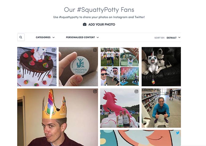
They could interview some of their fans about why they like Squatty Potty so much and develop their community. They could make more effort like they have done in the past with fans like Alisa, who have written in-depth posts about Squatty Potty’s product.
UX summary
There are many points in the conversion funnel where customers can drop off, and the average website conversion rate is less than 3%. There’s an art and a science to persuading visitors to convert — whether that be to buy, subscribe, register or download.
The hard data that lies behind the design of optimized sales funnels has proven itself true time and again. It’s sometimes all that stands between a customer who converts, and one who abandons their cart.
For example, using videos on landing pages can increase conversions by 86%. If Squatty Potty’s landing page is their homepage, they’re onto a winner. Their promotional video takes pride of place on the homepage above the fold, showing that they also anticipate why many users may come to their website in the first place.
Overall, their website is intuitive and simple to navigate. They make use of a long scrolling homepage to tell a story about Squatty Potty, explain the benefits of their product and engage users with the brand.
At the same time, the more traditional ecommerce design of their product pages ensures visitors have all the information they need to prompt them to make a purchase design.
It’s insanely easy to do what Squatty Potty really wants you to do — buy one of their products.
SEO
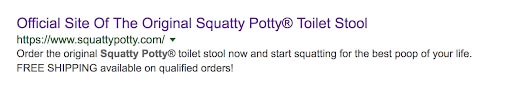
How is Squatty Potty ranking for SEO? They are the top result for ‘squatty potty’, which is exactly how it should be.
Titles and meta descriptions
Searching for the term ‘squatty’ yields good results.
Squatty Potty is using less than the recommended 70 characters for it’s homepage title. They could be filling more of this valuable search real estate with persuasive copy getting audiences to click. At the same time, Google will show a shorter title on small screens, so Squatty Potty could be anticipating mobile visitors.
Title relevancy to page content is 89% which is very good. This means the page title keyword optimization matches with the keyword optimization of the page content.
Title relevancy to page content is 89% which is very good. This means the page title keyword optimization matches with the keyword optimization of the page content.
For its meta description, it’s using less than the maximum 160 characters, after which the description is truncated. It looks good on the page and the copy is urgent and compelling. They’ve included the fact that free shipping is available and gone for the unusual technique of using capitals for ‘free shipping’.
This could look very spammy, but they trust that their predominantly American audience is familiar with their brand.
Recomendations: Make your titles 60 characters or less. Make your meta descriptions longer than 80 and fewer than 160 characters. Include your target keyword in these tags to attract more organic traffic.
Interestingly, Squatty Potty takes a different approach for their .com and co.uk domains. It seems they view British shoppers as more conservative, and perhaps are less aware of the Squatty Potty brand.
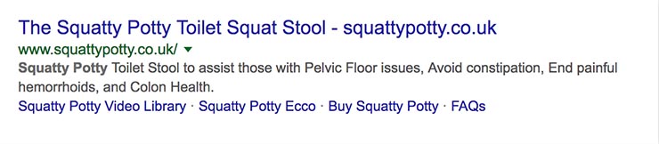
They’ve opted for a meta description that simply explains in dry terms the purpose of the Squatty Potty toilet stool, which is in keeping with the style of their UK website.
They’ve marked up their website very well — Google is pulling in navigational links to the rest of the squattypotty.co.uk website.
Page speed
Page speed is an important ranking signal for Google as research shows that slow loading pages are responsible for higher bounce rates. In fact, faster page loading speeds can increase conversions by 16.5%.
On mobile, the page speed for the domain squattypotty.com is rated as poor and likely to deliver a sub-optimal User Experience. It was only faster than 22% of other sites that have been tested.
Got an Ecommerce Business?
A Free 20 minute call with us could mean a steady 20% Increase in sales each month.